Modular Architecture
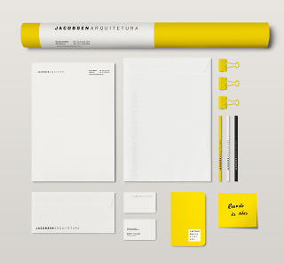
To design Jacobsen Arquitetura’s visual identity we explored the lightness, luminosity and simplicity that Paulo and Bernardo Jacobsen’s architecture projects are famous for. We wanted it to be adaptable to different mediums, in the same way architecture adapts itself to different spaces, landscapes and ecosystems.
From outdoor signs to Facebook avatars, desktop to mobile, line to square; the logo has a logical structure to make it readable and recognisable in any circumstance. We chose a warm and vibrant yellow – the symbol of light – stimulating creativity and team communication, as well as inspiring customer’s confidence.
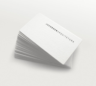
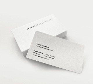
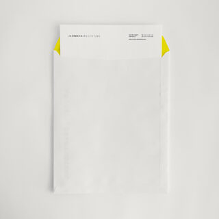
Stationery
The stationary we developed consists two parts:
- A technical one, highlighting the clarity of information and focused on internal communication.
- A commercial one, interesting, reflecting the simplicity and elegance of Jacobsen’s architecture.
We explored the purity of this aesthetic choosing white for majority of materials, textures, colourless reliefs and minimalist prints.
Website
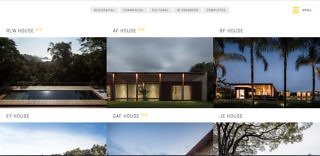
Their work speaks a thousand words. We made so that people could just admire it, unencumbered with interface or long load times.
Navigation was especially designed so that users would stay on the site and browse projects like they would a magazine.
Social Media
Jacobsen Arquitetura chose the social networks Instagram and Facebook to communicate the studio’s news with students, clients and fans on a daily basis.
For over two years we’ve been maintaining the quality of their posts, reaching potential customers in a global scale.