From naming to branding
After more than 20 years running Delight restaurant, Luiz Cláudio Varejao decided is was time to change. Tracking the revitalization of Porto Maravilha area (Rio de Janeiro, Brazil), the new cuisine brings a healthy, practical and responsible cooking, prioritizing local producers and seasonal ingredients.
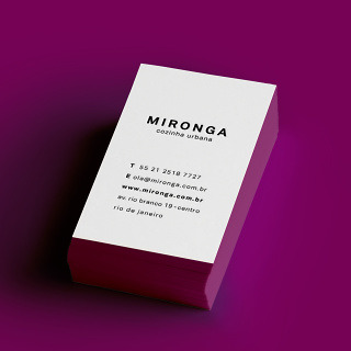
For his new project, Luiz invited us to design the restaurant brand and visual strategy which enabled the establishment transformation: starting with the definition of the restaurant name itself. Consecrated through a song by Brazilian poet and musician Vinicius de Moraes, the word Mironga comes from the Quimbundo african dialect and it means secret. With strong cultural resonance, the name “Mironga” reflects a Brazilian, feminine and popular cuisine.
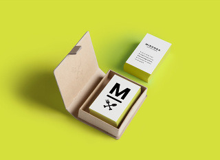
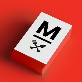
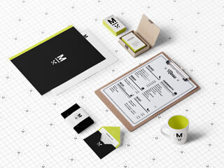
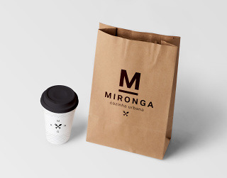
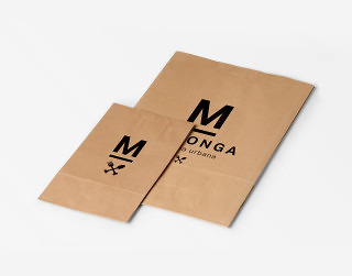
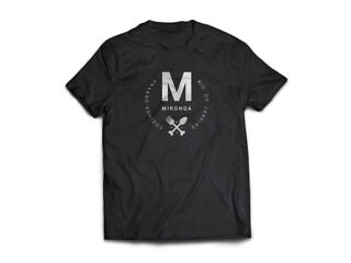
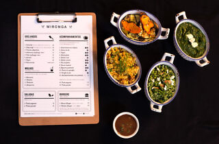
Simplicity and authenticity were the key words on the design process. Inspired by the cross symbols of Middle Ages and urban signs – such as the metro’s M – the visual identity unfolds, from a complete version to an iconic one. The color palette is mainly black and white – bright colours such as watermelon red, grape purple and lime green appear occasionally in reference to the menu freshness.
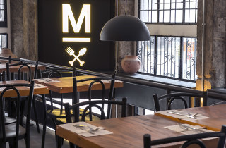
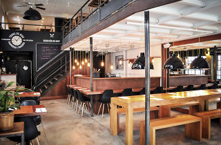
The interior design privileges materials such as wood, brick and cement to match the ideal cuisine where the ingredients are the highlight.